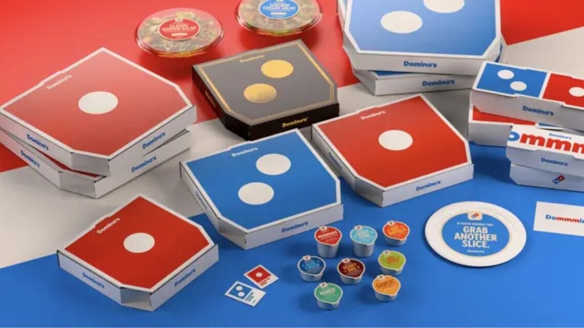
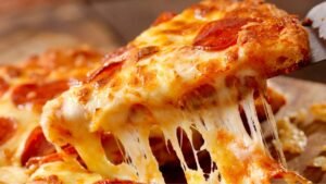
Domino’s is shaking up its image after more than a decade. The pizza giant has launched a major rebrand featuring fresh colors, custom fonts, revamped packaging, and a new jingle to mark the beginning of its “Hungry for MORE” era.
This transformation isn’t just cosmetic—it’s a strategic move aimed at connecting with younger generations while staying true to its loyal customers. Let’s explore what’s changing, why now, and how Domino’s is redefining its slice of the global pizza market.
What’s Changing: The Refresh Elements
Here’s what Domino’s is updating as part of its 2025 rebrand:
| Element | New Changes / Features |
|---|---|
| Brand Colors | Sharper, brighter red and blue tones for a modern appeal |
| Typeface | New custom font called “Domino’s Sans” for a clean, digital-friendly look |
| Packaging | Redesigned boxes — featuring bold graphics and some black-and-gold premium variants |
| Jingle / Audio | New “Dommmino’s” jingle, voiced by Shaboozey, designed to enhance brand craveability |
| App & Website | Updated interface with dynamic visuals and redesigned logo presentation |
| In-Store Graphics & Uniforms | Fresh signage, modernized store visuals, and updated team uniforms |
| Print & Marketing Materials | Complete overhaul of menus, posters, and digital advertisements |
These updates will be gradually rolled out across U.S. and international markets throughout 2025. The goal is to unify Domino’s visual identity across all touchpoints — from pizza boxes to app screens — ensuring that the brand feels consistent, exciting, and modern.
Why Rebrand Now?
1. Adapting to Evolving Consumers
Domino’s new look reflects its mission to remain timeless yet contemporary. With Gen Z and Gen Alpha emerging as dominant consumer groups, the brand recognizes the need to align with modern aesthetics, bold visuals, and social media-friendly design.
2. Strengthening Brand “Craveability”
A key part of the refresh is Domino’s new focus on “craveability.” The new jingle emphasizes the “mmm” in “Dommmino’s,” turning it into an audio signature that evokes hunger and emotion — a subtle but powerful branding tool.
3. Refresh Without Losing Equity
Rebrands can be risky, especially for legacy brands. Domino’s avoided the pitfall of alienating long-time fans by keeping its core identifiers intact — the logo, colors, and pizza-first focus — while enhancing energy through modernized visuals and sound.
4. Digital & Visual Impact
In today’s fast-paced, content-driven world, Domino’s wants its digital presence to be instantly recognizable. The new color scheme and graphics are designed to pop on screens, from TikTok videos to delivery app thumbnails.
Rollout Strategy & Timeline
1. Immediate Steps

Redesigned pizza boxes are already hitting shelves, and app visuals are being refreshed to match the new identity.
2. Store Updates
Team members will soon sport updated uniforms — sleek, minimalistic designs that align with the new branding. In-store signs and displays will follow suit.
3. Global Synchronization
Domino’s plans to synchronize the rebrand across marketing, packaging, storefronts, and digital assets by the end of 2025, ensuring a consistent experience worldwide.
The rebrand rollout is phased strategically to minimize disruptions while generating steady excitement and customer engagement.
Risks, Reception & Industry Comparisons
1. Risks
- Changing too much could confuse long-term loyalists.
- A tone-deaf refresh could feel like trend-chasing.
- Updating thousands of stores and packages is a massive logistical challenge.
2. Reception
So far, brand experts have praised Domino’s for “refreshing without alienating.” Unlike other rebrands that strayed too far from their roots, Domino’s has struck a balance — maintaining its recognizable charm while injecting new life into its image.
Experts also note that Domino’s success lies in preserving its brand DNA — keeping its famous logo and name intact while upgrading everything else around it. The result is a revitalized yet familiar brand that feels fresh without losing authenticity.
The “Evolution of a Slice” marks a pivotal moment for Domino’s — blending heritage with innovation. By updating its look, sound, and feel, Domino’s is proving that even the most iconic brands must evolve to stay relevant.
Its “Hungry for MORE” campaign embodies growth, energy, and connection with a new generation of pizza lovers.
With a legacy spanning over 60 years, Domino’s continues to lead the fast-food industry — not by reinventing the wheel, but by making sure that every slice, sound, and color tells a story of progress, passion, and pizza perfection.
FAQs
Is Domino’s changing its logo completely?
No. The core logo remains the same, but with refreshed tones, cleaner edges, and enhanced visual energy.
Who created the new Domino’s jingle?
The catchy new “Dommmino’s” jingle is performed by Shaboozey and designed to make customers associate the brand with irresistible pizza cravings.
Will this rebrand affect Domino’s menu?
No. The rebrand focuses purely on visuals, audio, and design. The recipes and menu favorites remain unchanged.